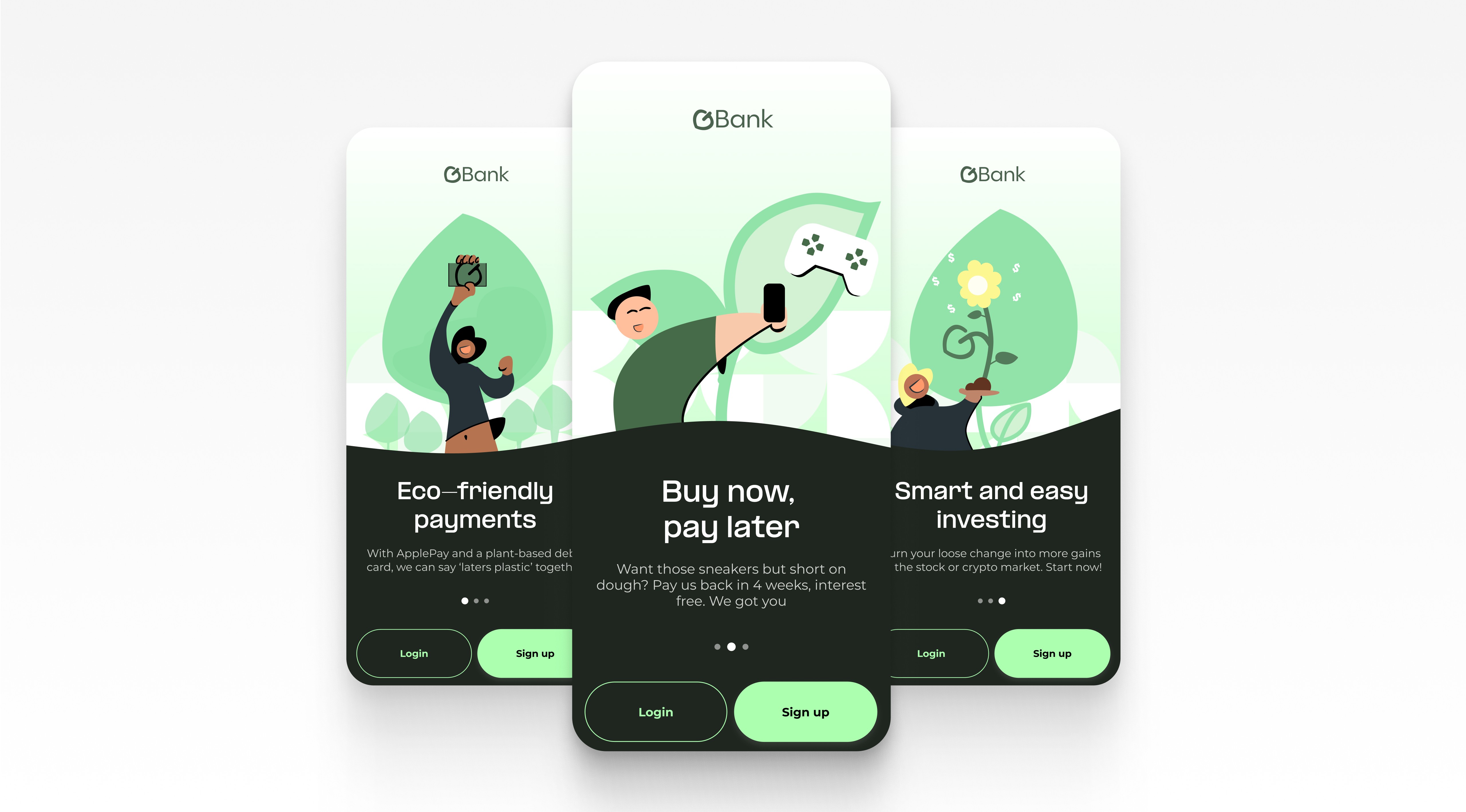
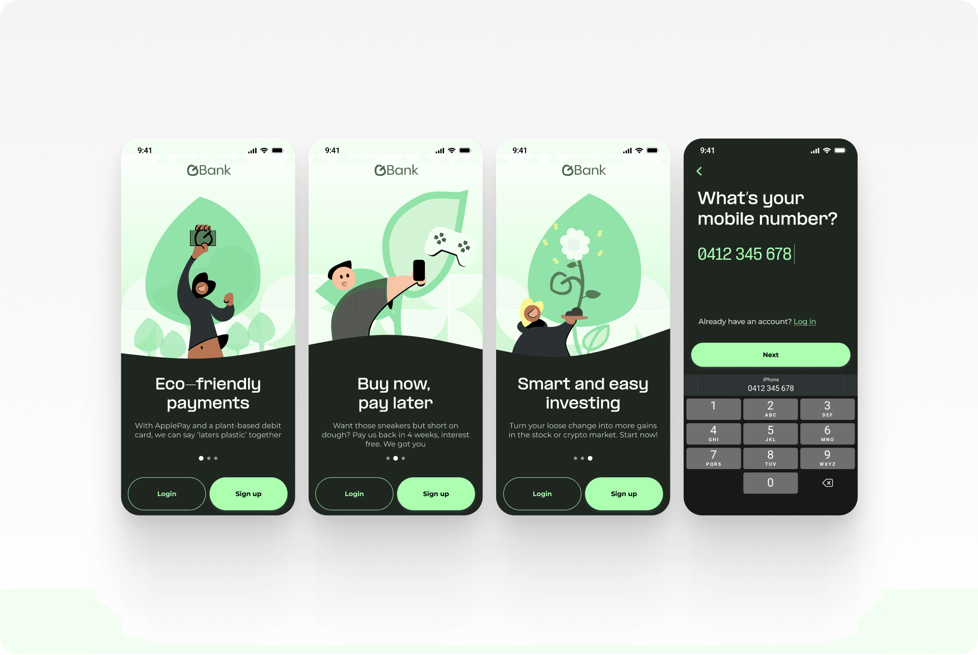
A 4-hour design challenge from Commonwealth Bank
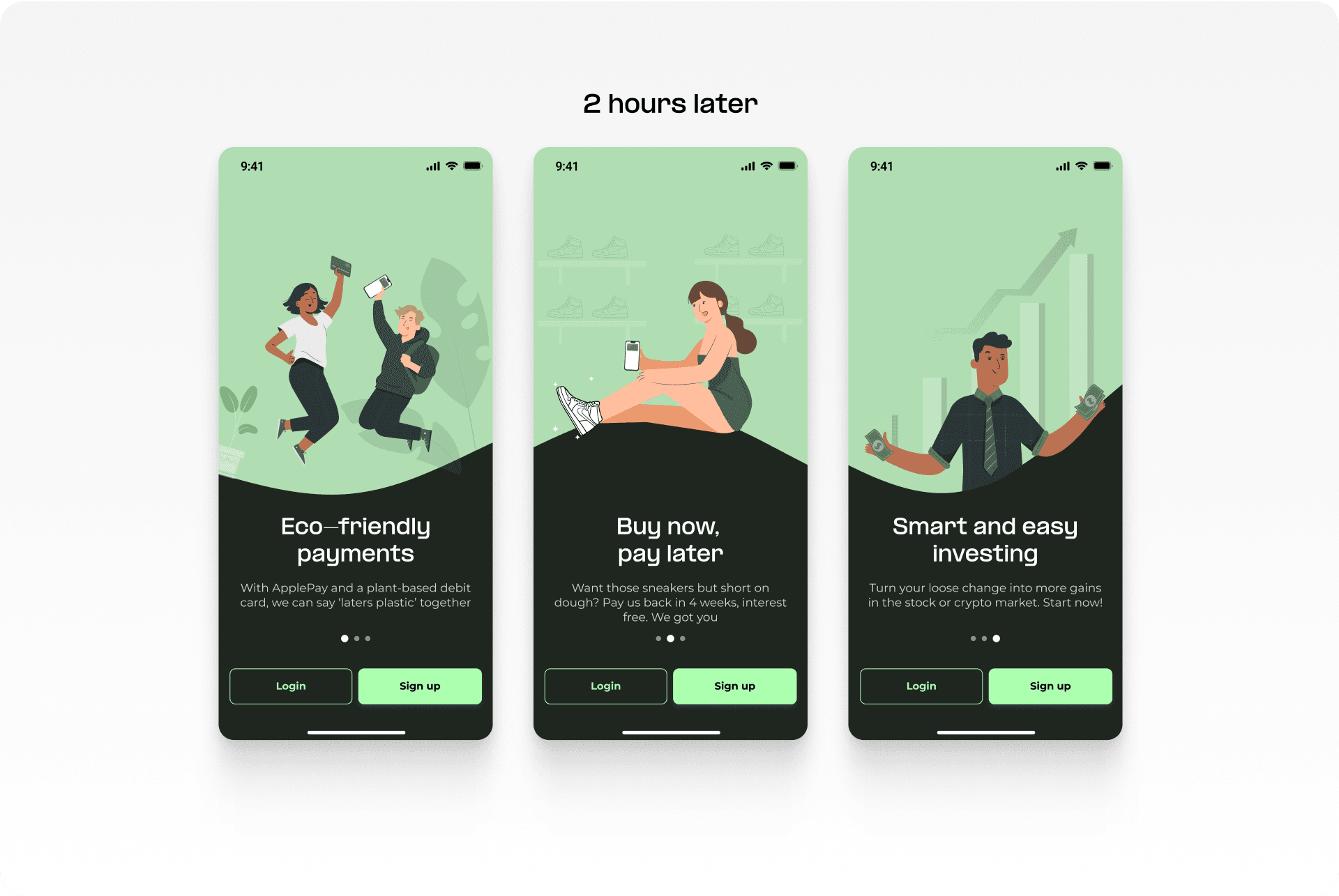
The brief was to conceptualise the app’s brand and come up with three value propositions targeting young adults. I was given four hours to complete this challenge from concept to delivery. Further exploration was conducted afterwards.
Client
Commonwealth Bank of Australia
Industry
Fintech
People involved
Me and Lead UI Designer (Reviewer)
Scope of work
UI Design, Wireframes, Brand Identity, Illustrations, Animations, Prototyping
The process
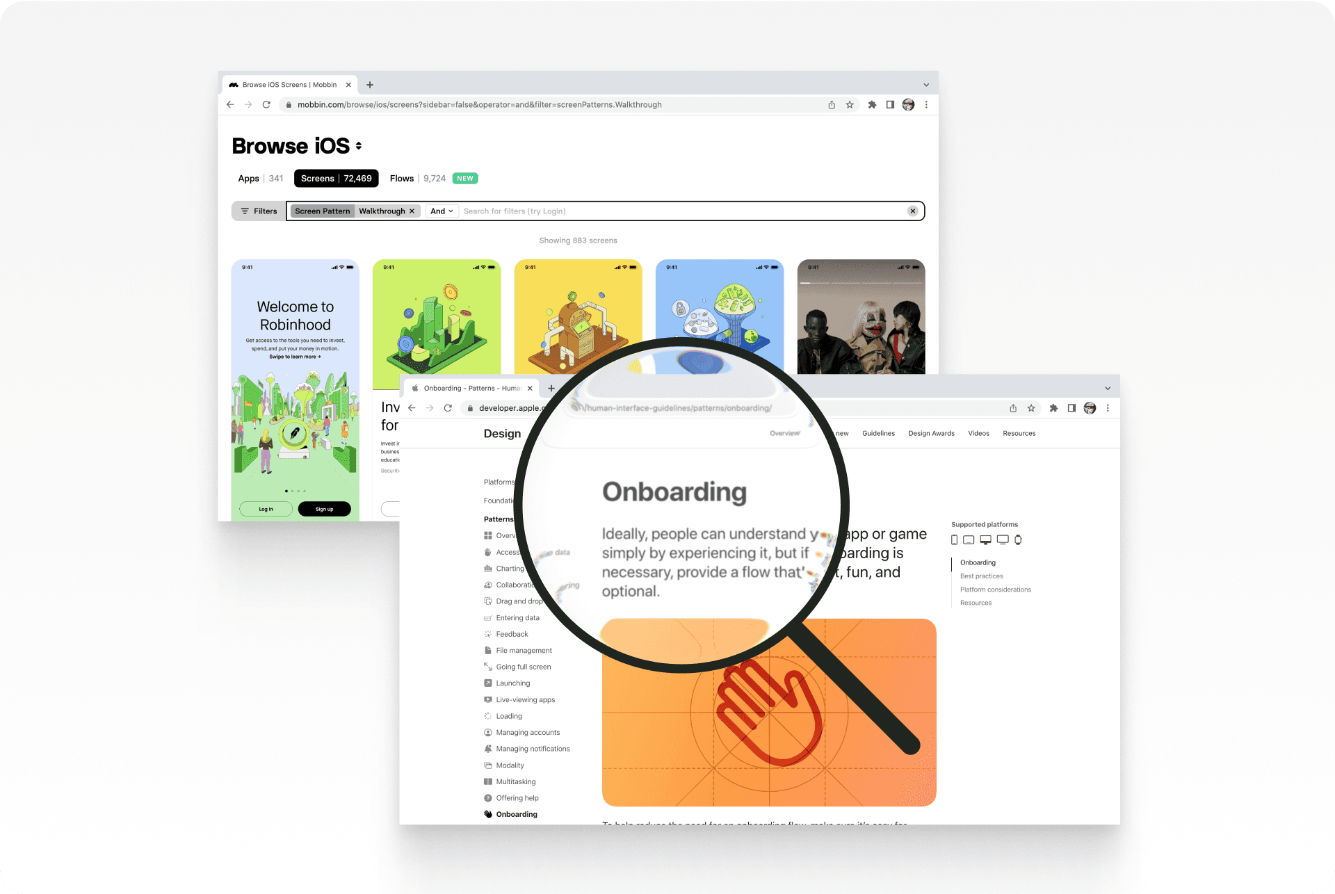
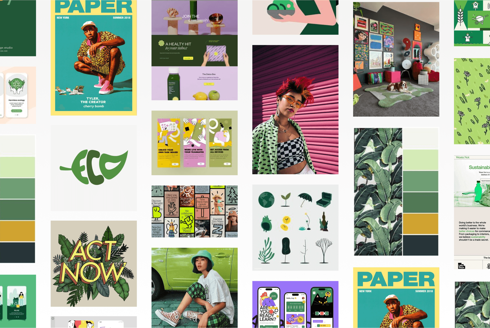
Researching global trends and observed peers to understand young adults' fintech preferences. Analysing popular fintech apps' onboarding experiences. I initially wanted to create an Instagram-story-like flow but with a short deadline I opted for something simple while still effective. A moodboard design based on key words from the brief helped refine the overall visual direction. Green was chosen for its natural and optimistic associations. Additionally designed a logo—a leaf vector resembling a "G"—fitting for the brand name. Diverse illustrations enhance inclusivity, and a modern dark theme which appeals to most young adults.
Feedback & iteration
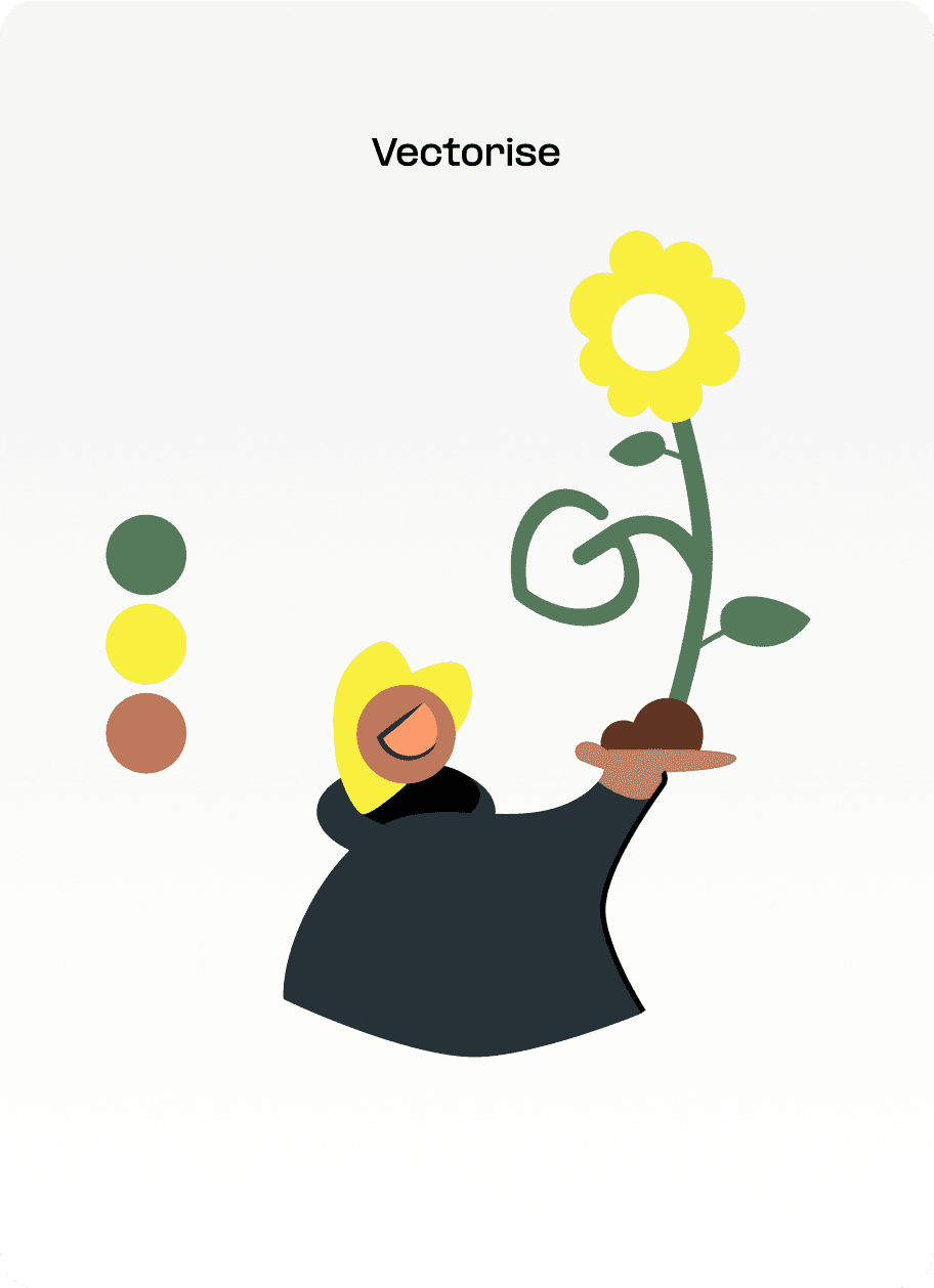
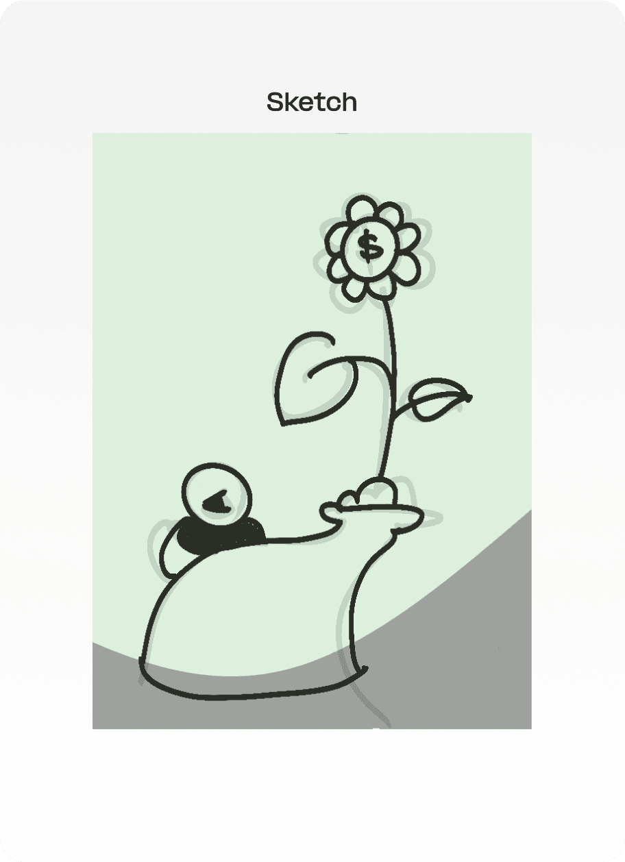
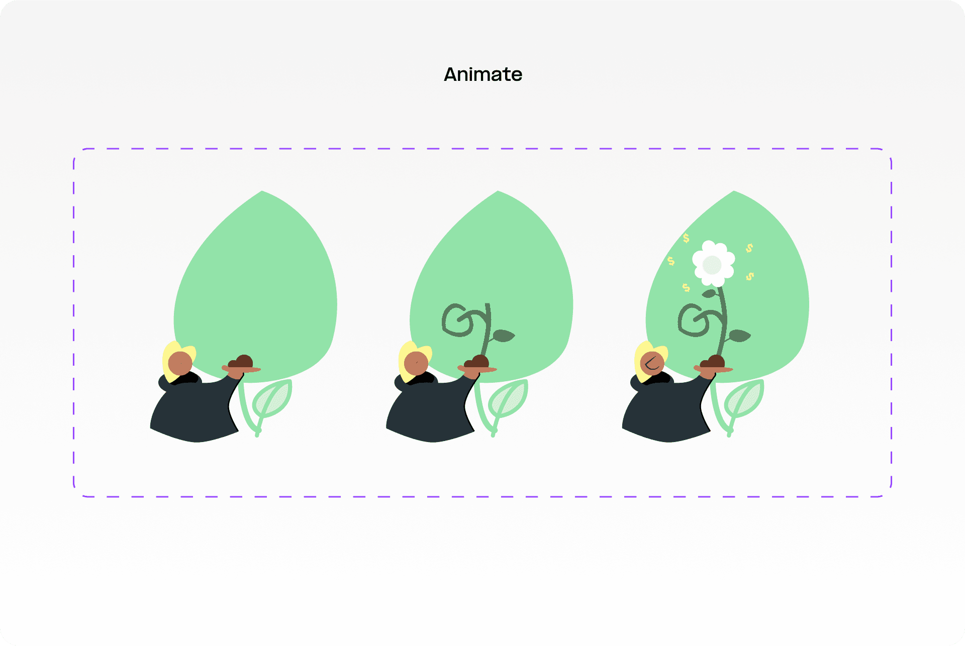
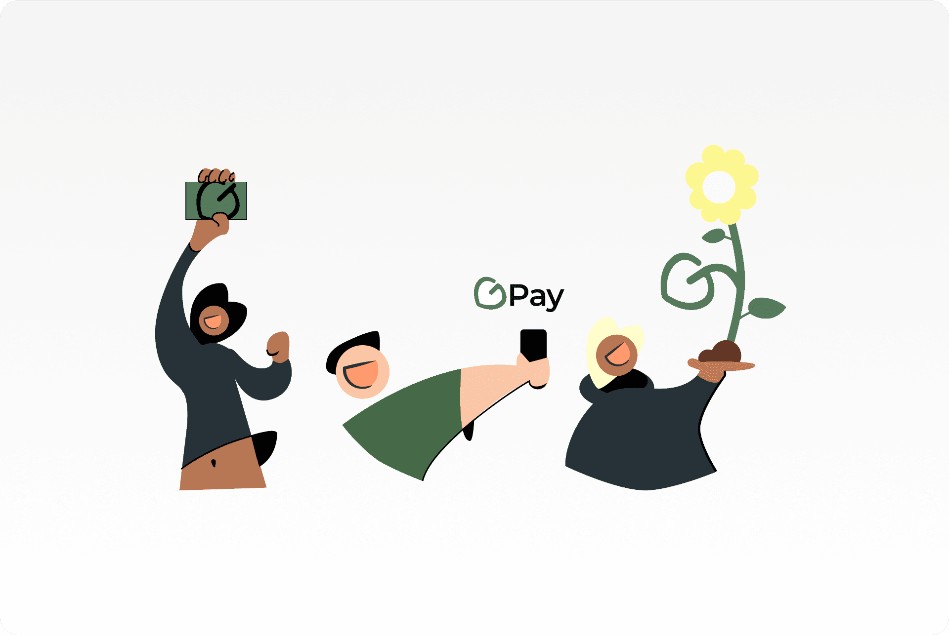
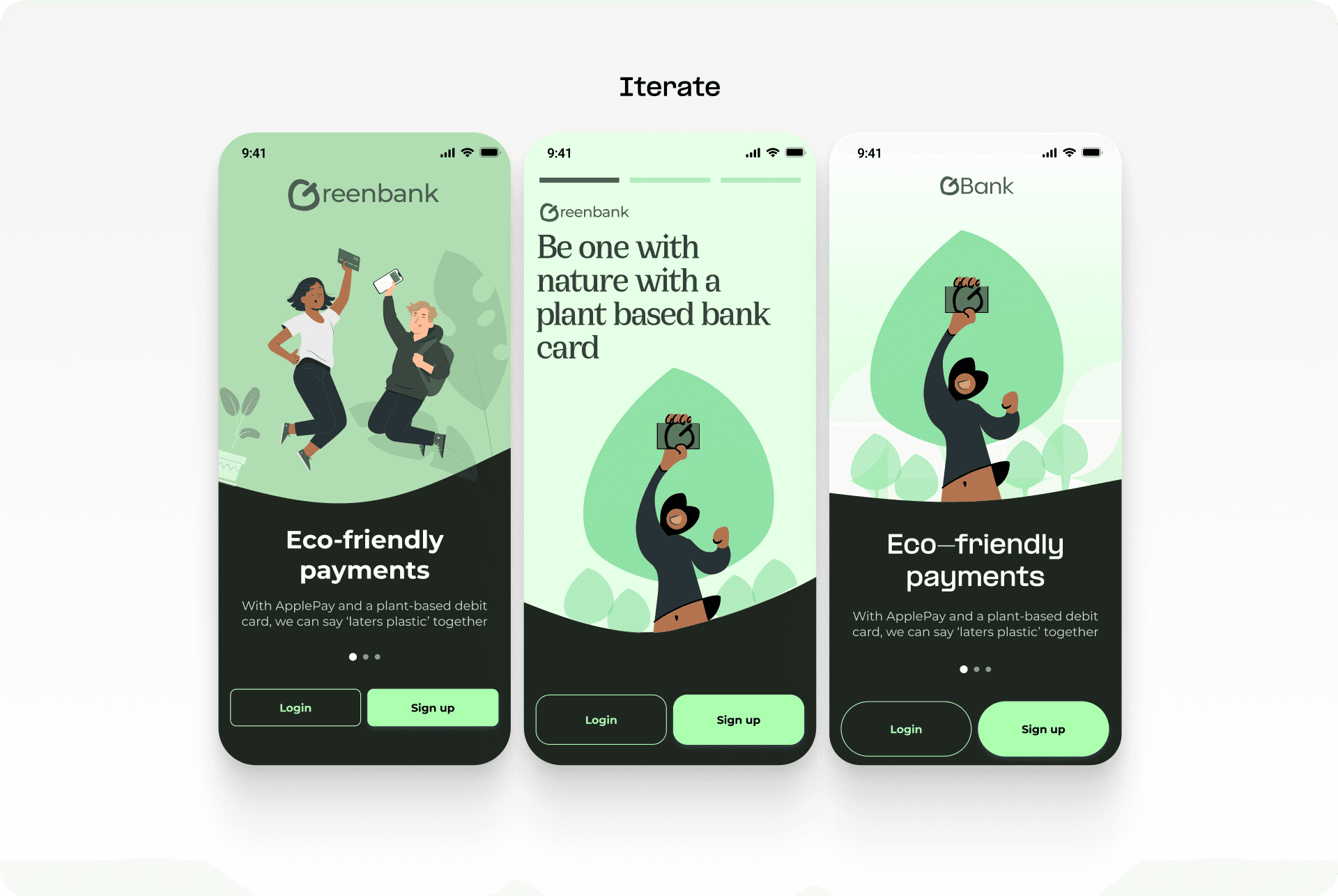
The Lead UI Designer gave positive feedback on the colour palette, visual hierarchy, and wave background, but suggested reducing stock illustrations and incorporating more branding. In response, I created my own animated illustrations for a stronger brand image and increase engagement.
Learning how to work efficiently
Creating a brand from concept to delivery in four hours was challenging, requiring quick decisions on colour, illustrations, and the onboarding journey based on customer needs. Using web tools like Mobbins.io which is like Pinterest with real app interfaces. This allowed me to have more time to cook and iterate to perfection. Time-boxing these activities was crucial for me to plan and deliver within the deadline.
Below are some of the iterations after my 4 hour deadline.

